HOW TO BUILD A PROFESSIONAL WEB SITE     Rel. 1.1

LESSON 04 - Chapter i

How to build a Professional Web Site by Carlo Scodanibbio Valid XHTML 1.0!
home course program course leader enquiries enrol testimonials download

Lessons
welcome
1 - chapter a
1 - chapter b
1 - chapter c
1 - chapter d
1 - chapter e
1 - chapter f
1 - chapter g
1 - chapter h
1 - chapter i
1 - chapter j
1 - chapter k
2 - chapter a
2 - chapter b
2 - chapter c
2 - chapter d
2 - chapter e
2 - chapter f
2 - chapter g
2 - chapter h
3 - chapter a
3 - chapter b
3 - chapter c
3 - chapter d
3 - chapter e
3 - chapter f
3 - chapter g
3 - chapter h
4 - chapter a
4 - chapter b
4 - chapter c
4 - chapter d
4 - chapter e
4 - chapter f
4 - chapter g
4 - chapter h
4 - chapter i
4 - chapter j
4 - chapter k
5 - chapter a
5 - chapter b
5 - chapter c
5 - chapter d
5 - chapter e
5 - chapter f
5 - chapter g
6 - chapter a
COMMENTS AND CLARIFICATIONS:
  • Firstly, note the "settings" of the WIDTH Attribute, all made through the equals sign and quotation marks to enclose the value.

  • Now, look at the first HR starting from the top. Its width has been set at 20 pixels. That means 20 elementary "dots" in the matrix of your screen. If you are familiar with these matters, just go ahead, otherwise it might be worthwhile for you to read this quick tutorial on "screen resolutions" and related issues (Enclosure 10).

    This 20 pixels setting is "absolute", in other words the width of this HR is "solid" - 20 pixels in width will remain 20 pixels for everybody's screen, all over the world.
    BUT, the "real" width in cm. or inches of this HR will vary depending on the "screen resolution" of your visitor. Lower screen resolutions will display this HR "wider" than higher screen resolutions. This applies to the second and third HR as well, since they are set at an "absolute" width. Their 100 and, respectively, 250 pixels will be the same number of pixels in everybody's screen, but their real width, again, will vary according to screen resolution. This is well understandable: a 14" screen working at a screen resolution of 640 x 480 contains less pixels, both horizontally and vertically, than a 14" screen working at 800 x 600 screen resolution. Therefore any "object" of a certain dimension in pixels will look bigger in the first screen than in the second one, simply because the size of a pixel in a 640 x 480 screen is "bigger" than the size of a pixel in a 800 x 600 screen of the same dimension in inches. Voilá. If you feel confused, just imagine how I feel after giving this long explanation... huh, huh.

  • Now look at HR 4, 5 and 6 from the top. Their setting is "relative", which means "in percentage of the available Browser Window Width". The last Image above, displaying the 6 HR, is exactly 454 pixels wide (that's the width I decided to give it). If you take away about 6 pixels for the left Window margin and about 20 for the right one (which includes the scrolling bar), you are left with an "available Browser Window Width" of approximately 428 pixels. So the 4th HR from the top, having a width of 30% of the available Window Width, is being displayed like if it was a HR of about 128 pixels in width. In fact, you may see that its real width is slightly bigger than the width of HR number 2 (from the top) which was set at an absolute value of 100 pixels. In conclusion, "it makes sense". You can see how "clever" a Browser is, and how accurate its maths is !! But, be careful: all I am saying is true at the screen resolution I am using now, which is 800 x 600. Things might be rather different at different screen resolutions.

  • Now look at the bottom HR (the 6th from the top). Its relative setting is 100% of the available Browser Window Width. It is equivalent to a HR in which the WIDTH Attribute is not used. Now you will ask: why is this HR less, in width, than the Browser Window Width ? In other words, why does it not reach both the left and right margins of the Browser Window ? Well, this is because it would not look nice at all ! So, each Browser introduces a bit of padding, both left and right, instead of squashing the poor HR against the margins. How big is this padding ? It depends on Browser model and version. For Explorer 5.5 this padding (or spacing) is about 10 pixels, but it might be slightly different in a different Browser or Version of Explorer. In conclusion, this must be taken into account if you need to design a Page very accurately: testing and checking how a Page is displayed by different Browsers/Versions would be very beneficial (as I said already). Besides, with some experience you will learn these tricks by heart, so do not feel depressed now.....
And now, a bit of fun. Let's resize the Browser Window !!!
You should remember how to resize a Window [if not, look again at the tutorial (Enclosure 05) I gave you in Lesson 02].
So, play with this window, and make it narrower. You should get, in sequence, narrower windows, as follows:

img

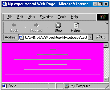
Here you can see that the first 3 HR maintain the same width because of their absolute setting, while the last 3 are becoming narrower, but still proportional to the Browser Window Width.


img

The phenomenon is even more evident in the above Window.


img

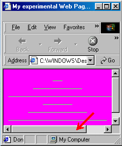
Now the Window is so narrow that it cannot contain the full "solid" HR number 3 (from the top) with absolute setting: so the poor Browser does its best to still display it, but it must insert horizontal scrolling bars (which occupy some vertical space, so that, as a consequence, also vertical scrolling bars are inserted).
Yet, the last 3 HR (those with % settings) keep resizing proportionally to the Browser Window Width.


img

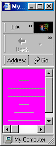
Things are really extreme here (in fact nobody will browse the Net at such a Browser Window Width, but I just want to show you the Browser mechanism....): the second and third HR (solid) cause the presence of scrolling bars while the 3 bottom HR keep resizing according to Window Width....

Obviously there is something to learn from this little game.
If you often surf the Net, I am sure you have come across several Web Sites that are a pain in the neck. Why ? Because, even at full screen Browser Window, you need to scroll left and right to see their content (be it text or images, or whatever else). Well, those Web Sites have not been designed very professionally.
The simple golden rule is: if you love your Web Site Visitors, make sure you won't give them any trouble of this sort (horizontal scrolling bars), because it is really annoying. A visitor that has to scroll left and right to visit a Web Site will very soon become very frustrated and surf away elsewhere !

So the professional Web Designer always tries to ensure that his or her Pages display well under any circumstance (read: under the most popular screen resolutions) with any Browser.
That's why I wanted you to play with Window resizing: this is a little trick you will have to use often to test your Pages - in fact I will come back to this point several times in this course.

By the way, the majority of those "pain in the neck" Web Sites have been made - guess how ? - with those famous wizards like MS Frontpage !
I have nothing against those Wizards, but this is what they may cause. You want to know why ? Simply because they "design" HTML code according to the Designer Computer settings, but ignoring completely Visitors and their Computers... Hoh, hoh, now you should start understanding things.
In conclusion, the Professional Web Designer may use those Wizards - but he or she should also know how to correct their likely deficiencies. For this, he or she needs to know HTML !!


previousgo back to previous chapter shut-down this HTML story ! go to next chapter - if you still have enough energy....next

http://webbuildcourse.tripod.com

full details of this Course at
http://www.scodanibbio.com/webbuild


Copyright © 2001 onwards Carlo Scodanibbio | All Rights Reserved