|
Lessons
welcome
1 - chapter a
1 - chapter b
1 - chapter c
1 - chapter d
1 - chapter e
1 - chapter f
1 - chapter g
1 - chapter h
1 - chapter i
1 - chapter j
1 - chapter k
2 - chapter a
2 - chapter b
2 - chapter c
2 - chapter d
2 - chapter e
2 - chapter f
2 - chapter g
2 - chapter h
3 - chapter a
3 - chapter b
3 - chapter c
3 - chapter d
3 - chapter e
3 - chapter f
3 - chapter g
3 - chapter h
4 - chapter a
4 - chapter b
4 - chapter c
4 - chapter d
4 - chapter e
4 - chapter f
4 - chapter g
4 - chapter h
4 - chapter i
4 - chapter j
4 - chapter k
5 - chapter a
5 - chapter b
5 - chapter c
5 - chapter d
5 - chapter e
5 - chapter f
5 - chapter g
6 - chapter a
|
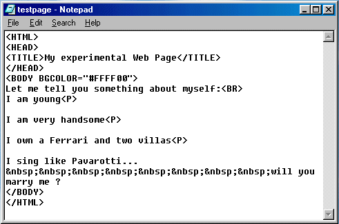
In conclusion the right way of writing the previous sentence is :
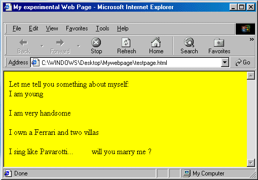
which will result in this:
Please note the following:
- You may use as many LINE BREAK TAGS as you wish: the first will start a new line, and each additional one will skip a line - Example: <BR><BR><BR><BR><BR> will start a new line after skipping 4 blank lines.
Tags may be spaced, with no difference in the effect :
<BR><BR> <BR>
<BR>
<BR>
- But you may use the PARAGRAPH TAG once only - adding more <P> one after the other will produce no effect.
For instance, <P><P><P><P> will just create a new paragraph.
- The right and best way, however, of creating "vertical" space is by using the <BR> and <P> Tags in combination, like this:
<BR><P>
<BR><P>
<BR><P>
<BR><P>
This will create 4 lines of vertical space between preceding and following text.
The vertical spacing will be proportional to the FONT SIZE of the "preceding" text (if there was a FONT Tag "not closed" yet - alternatively it will correspond to the standard vertical spacing of SIZE 3, default text).
- If you use more than one SPACE CODE, they should be contiguous - if they are spaced, the effect will be different (extra spaces added - test it by yourself).
And now, how about some exercising ? I am sure you were longing for it......
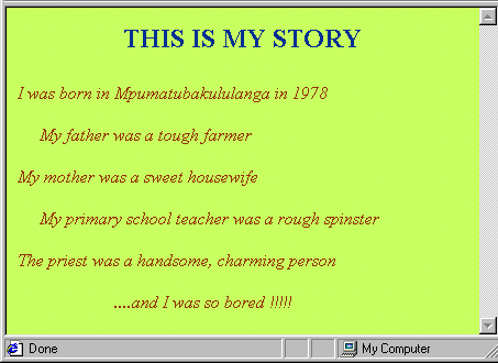
Exercise 04

Make a Web Page that looks similar to this:
Not too difficult, heh, heh....
Now, let me say something about Exercises: from now on you should try to make your Exercises "similar" to those I am proposing. This means:
- With an approximately similar background colour (it may be very difficult to guess which colour I am using....)
- Same story for Font colours
- With approximately similar Fonts sizes - here again it might be difficult to guess what sizes I am using and, moreover, the Exercises Images in my Lessons are somehow smaller than what they should be, in order not to occupy too much space on the screen....
In conclusion, what is important is that you understand the principle and the syntax behind any exercise, and that you try to keep approximately the same proportions and layout. Bong.
|
